

Iceberg
Created in 2015, Iceberg is a French retailer of Scandinavian wood-burning stoves for the average consumer. The brand differentiates itself thanks to its unique 360° offering and unexpected personality. After perfecting and redefining its offering, Groupe Valeor was ready to relaunch the brand in 2021 with big plans for expansion.
The Brief
Groupe Valeor wanted to create a more modern and relatable brand identity for Iceberg which would appeal to the average consumer. The challenge was doing so in a way that wouldn’t resemble Aäsgard, their other upscale brand of stoves which holds many of the same qualities and values as Iceberg.
The Solution
In order to prepare Iceberg for prime time, Martin Hamelin of Jerrycan Studio and I created a bold, playful identity which embodies Iceberg’s fiery passion and human approach to making their customers happy.
We focused our creative work on changing how people feel about modern wood-burning stoves. Iceberg now assumes a “cool-and-instructive” approach, playfully educating and accompanying its clientele through the entire customer experience, in turn making Scandinavian stoves more accessible and appealing to everyone. This concept was incorporated both editorially and visually with a 360-degree application, with everything from employee garments to social advertisements, to creative consulting on new store designs.
Expertises
Branding
Visual Identity
Art Direction
Logo Design
Print, Digital
Social Media Ads
Vehicles
Retail
Credits
Creative Strategy & Copywriting:
Martin Hamelin / Jerrycan Studio
Architects: Les Monomanies
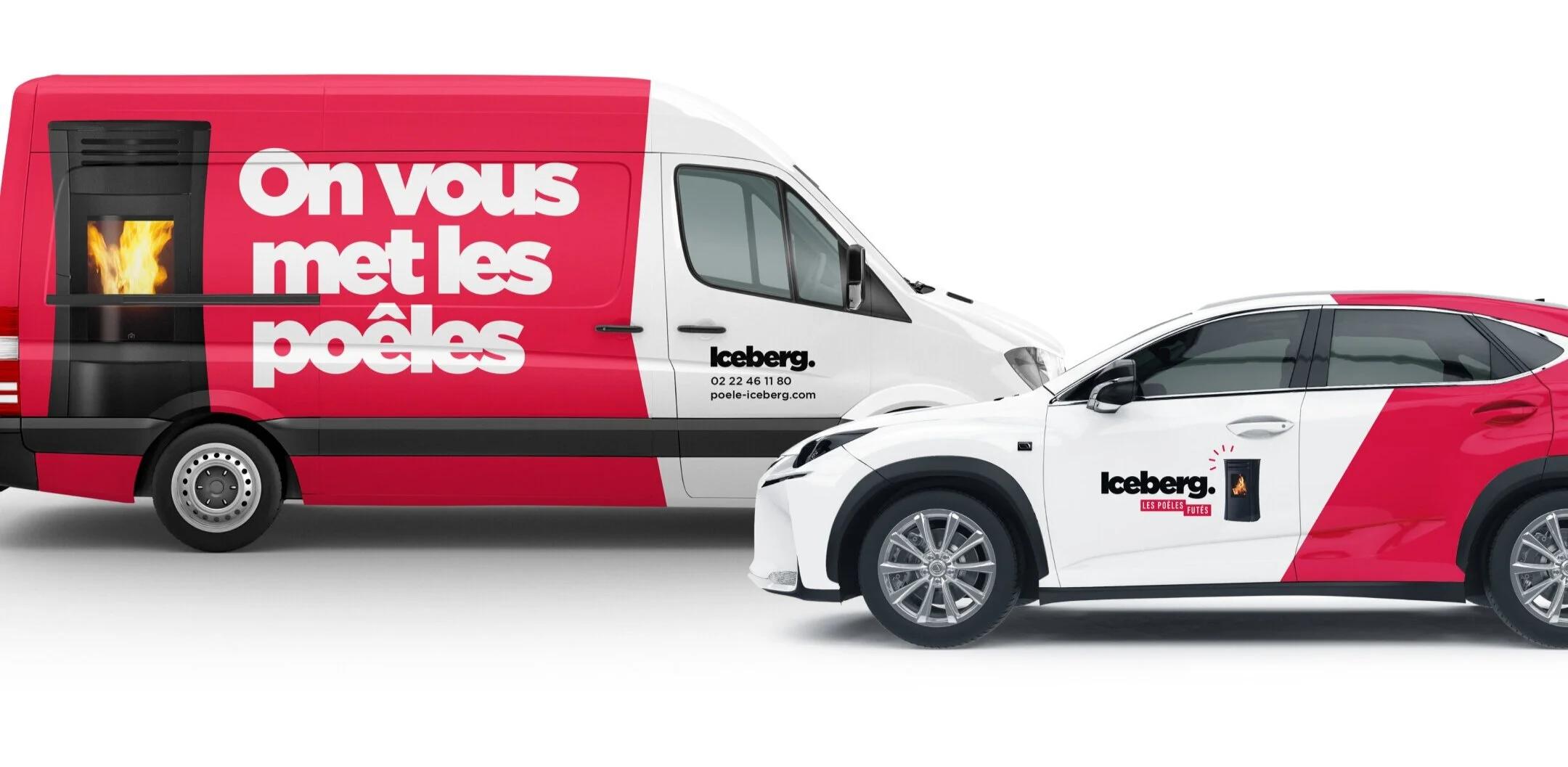
The Logo
Iceberg’s new logo illustrates the modern and human-oriented approach which the company uses across all of its operations. The slightly-rotated e’s add a hint of a smile while referencing the company’s original logo. Finally, combining the stove incorporates the company’s new product-centric direction and varying it from time to time embraces Iceberg’s goal to become France’s top wood-burning stove distributor.

Type & Colors
The creative is driven by bold typography which keeps everything straight to the point, placing emphasis on the message.
The simple combination of red, black, and white helps the brand to feel more like that of a wood-burning stove. The red especially feels at home in the fireplace landscape, but with a punchy and playful hue.


Graphic Language
Simple layouts help with message transmission, often combined with patterns and playful iconography that compliment the punny copywriting.

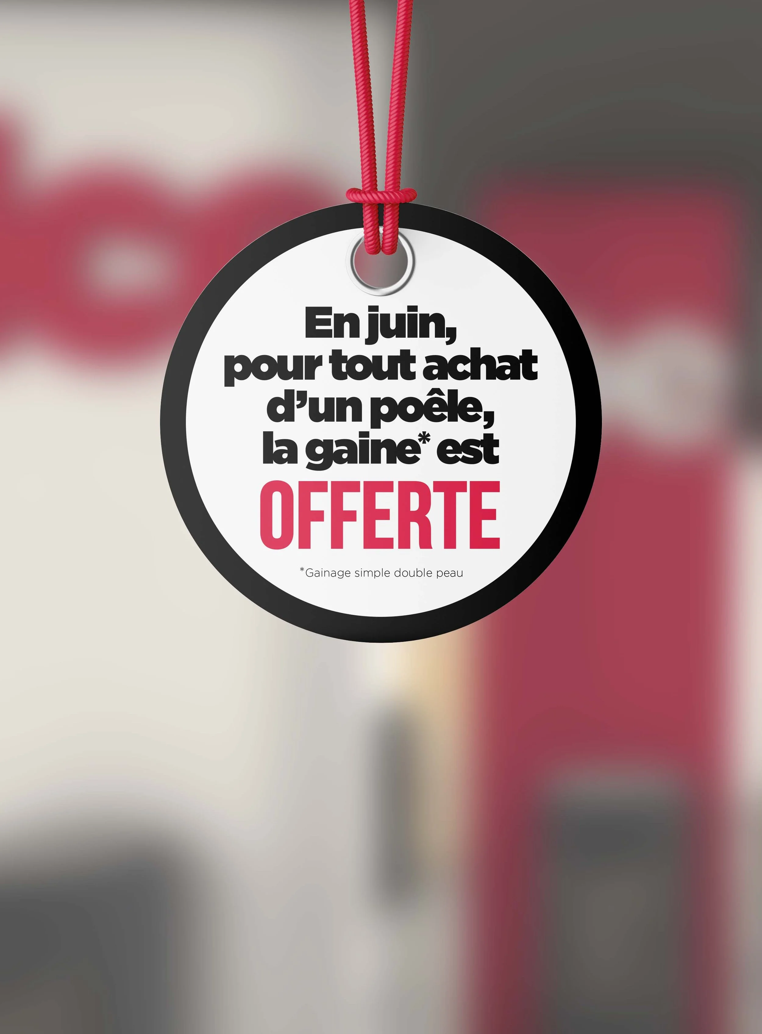
Promotional
Campaigns
Multi-channel campaigns were created to advertise Iceberg’s promotions each month: in addition to social media ads, floor decals complimented suspended signs in-store. To finish things off, a 4x3 storefront billboard drew in traffic each month with its creative messaging.


Extensive Brand Guidelines
Custom graphics and editorial guideline documents were created in order to ensure the brand’s long-term quality. These documents help to transmit Iceberg’s story, identity, tone of voice, and visual language to all stakeholders, whether they be in-store, at the corporate office, or elsewhere.

Branding, visual identity, brand strategy, art direction, design, print, posters, digital, social ads, logo creation, visual guidelines, graphic guidelines, style guide, brand book, retail, interior, vehicles, apparel, stationery, business card